Let’s talk about how to create an indie game website that will attract players and keep them interested. Your website is like the front door to your game, so you want to make sure it’s inviting.
People landing on your website are not just browsing; they’re potential players who are deciding if your game is worth their time. That’s a lot of pressure, but we are here to help.
In this blog post, we’ll share some tips for creating an eye-catching and engaging indie game website. We’ll cover everything from the overall design to the specific content you should include. So whether you’re just starting out or you’re looking to improve your existing website, read on for some helpful advice.
Understanding the Essence of Design for Indie Game Websites
When it comes to indie game website design, there are a few key things to keep in mind. First and foremost, it’s important to take a user-centric approach. This means designing your website with the needs and wants of your users in mind.
What are your target players looking for in an indie game website? What information do they need to make a decision about whether or not to play your game? Once you understand your users, you can start to design a website that meets their needs.
Effective design can also help you reflect the essence of your game and resonate with your target audience. This means using visuals and language that are consistent with the game’s style and tone. For example, if your game is a dark and atmospheric horror game, you would want to use dark colors and suspenseful music on your website. If your game is a bright and colorful platformer, you would want to use lighter colors and more upbeat music.
Finally, it’s important to balance aesthetics with functionality in indie game website design. This means making sure your website is both visually appealing and easy to use. A website that is too cluttered or difficult to navigate will turn players off. But a website that is too plain or boring will also fail to engage them.
The key is to find a balance that works for your game and your audience.
By following these tips, you can create an indie game website that is both user-friendly and visually appealing. This will help you attract new players, nurture leads, and build a community around your game.
Navigating the Landscape of Layout and User Experience
Once you have a user-centric design in place, it’s important to focus on the layout and user experience of your indie game website. This means making sure that your website is easy to navigate and that the information is easy to find.
Here are a few tips for creating an intuitive navigation and easy accessibility of information:
Use clear and concise menus that are easy to understand
This means avoiding jargon and using language that is clear and concise. For example, instead of using the word “interface,” you could use the word “controls.
Use breadcrumbs to help users track their progress through your website
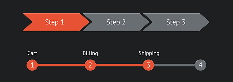
Breadcrumbs are a navigation tool that shows users where they are on a website. They are typically displayed at the top of the page and show the user’s current location as well as the links to the previous pages they have visited.
Include a search bar so that users can easily find the information they’re looking for
The search bar should be prominently displayed on the website and should be easy to use.
Make sure your website is responsive so that it can be viewed on both desktop and mobile devices
This is important because more and more people are using their mobile devices to access the internet.
Example:
The indie puzzle game “The Room” has a website that is both visually appealing and easy to use. The website features screenshots of the game, as well as a detailed description of the game’s mechanics. The website also includes a blog that provides players with hints and tips.
No-code Tools
No-code storefronts are a type of no-code tool that allows you to create an online store without having to write any code. They typically offer a drag-and-drop interface that makes it easy to add products, set prices, and process payments.
Other no-code tools like website builders can also be used to create an indie game website. Website builders typically offer more features than no-code storefronts, but they also require more technical knowledge to use.
Both no-code storefronts and website builders offer customizable layouts that cater to specific game needs. This means that you can create a website that is tailored to the specific features and gameplay of your game.
Visual Delights: Crafting Engaging Visual Design
Visuals are one of the most important aspects of any website, and indie game websites are no exception. The right visuals can help to capture visitors’ attention, convey the game’s theme, and make the website more engaging.
Here are some tips for creating engaging visual design for your indie game website:
Use high-quality images and videos
High-quality images and videos will make your website look more professional and polished. They will also help to convey the game’s theme and attract visitors’ attention.
Use a consistent color scheme
A consistent color scheme will help to create a cohesive and visually appealing website. It will also help to brand your website and make it more memorable.
Use clear and concise typography
The typography you use should be easy to read and understand. It should also be consistent with the overall design of your website.
Use whitespace effectively
Whitespace is important for creating a sense of balance and visual appeal. It can also help to make your website easier to read and navigate.
Avoid clutter
Clutter can make your website look unprofessional and overwhelming. It can also make it difficult for visitors to find what they’re looking for.
Be creative and original
Don’t be afraid to experiment with different visual elements. The goal is to create a website that is visually appealing and unique.
Choosing Visuals for The Indie Game Website
The above are the general guidelines. Here are some more tips concerning the visuals themselves.
When choosing visuals for your indie game website, it’s important to consider the following factors:
The game’s theme
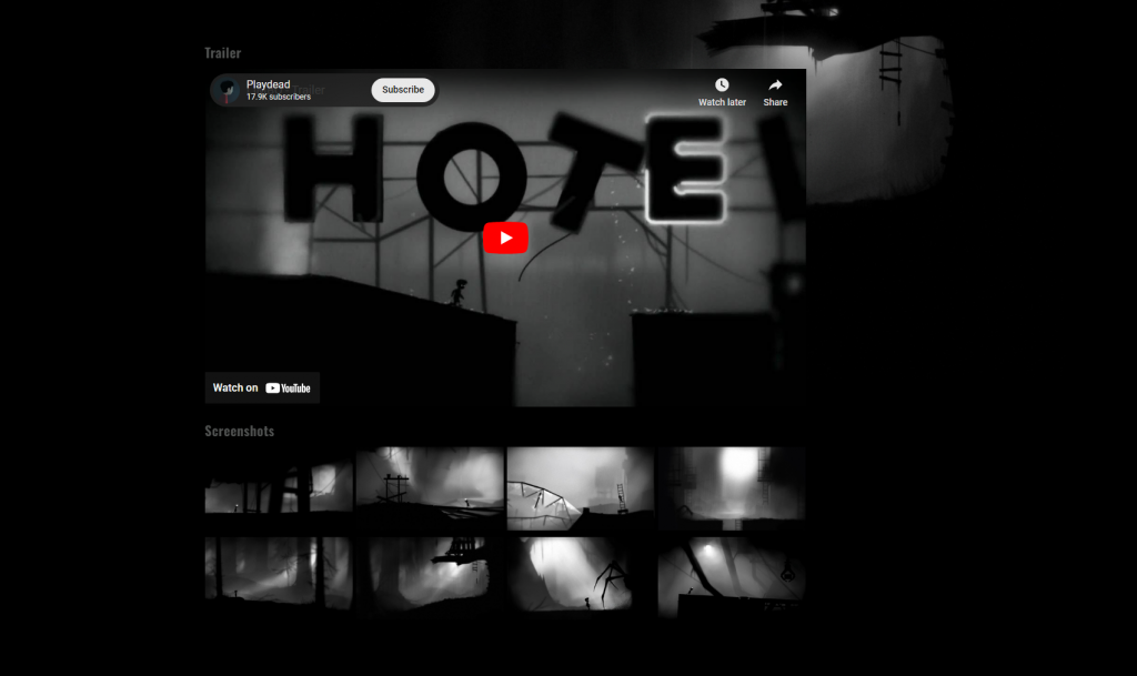
The visuals should be consistent with the game’s theme. For example, if your game simplified pixel graphics, you would want to follow this pattern on your website.
The target audience
The visuals should appeal to the target audience. For example, if your game is aimed at children, you would want to use bright and colorful visuals.
The message you want to convey
The visuals should communicate something about your game. For example, if you want to show that your game is fun and exciting, you would want to use playful and vibrant visuals.
In addition to choosing the right visuals, it’s also important to use responsive design. It ensures that your website looks good on all devices, from desktop computers to mobile phones.
Finally, you can also enhance user engagement by including interactive elements on your website. Interactive elements can be anything from parallax scrolling to animations. They can help to keep visitors engaged and coming back for more.
Building a Cohesive Brand Identity
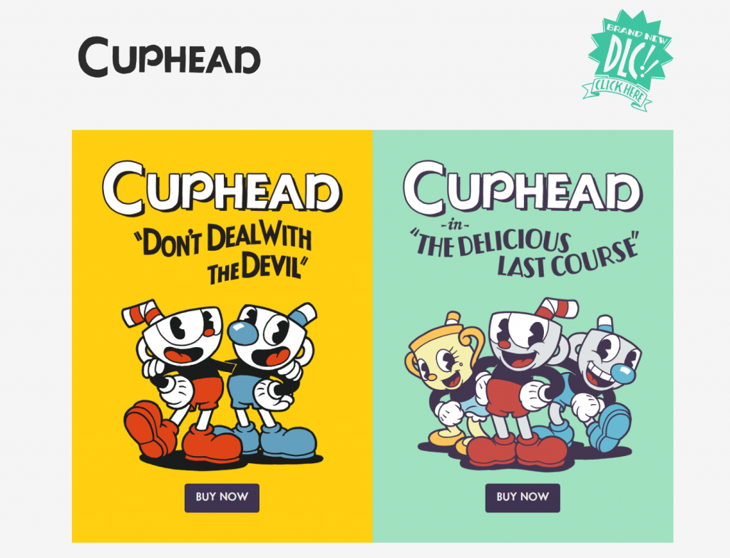
A strong brand identity is essential for any indie game developer. It helps to create a unique and memorable impression of your game, and it can help you to attract and retain players.
One of the most important aspects of brand identity is consistency. Your branding should be consistent across all channels, from your website to your social media presence to your marketing materials. This means using the same colors, fonts, and design elements throughout.
The colors you use in your branding should be carefully chosen to resonate with the game’s aesthetics. For example, if your game is a dark and atmospheric horror game, you might use dark colors like black, red, and purple. If your game is a bright and colorful platformer, you might use lighter colors like blue, green, and yellow.
The fonts you use should also be chosen carefully. They should be easy to read and should complement the overall style of your branding.
No-code storefronts can facilitate seamless integration of branding elements. This means that you can easily add your brand’s colors, fonts, and logos to your website and storefront. This will help to create a consistent brand experience for players, no matter where they interact with your game.
Here are some additional tips for building a cohesive brand identity:
- Be consistent
Use the same colors, fonts, and design elements across all of your marketing materials, including your website, social media pages, and game trailers.
- Be creative
Don’t be afraid to experiment with different colors, fonts, and design elements until you
find a combination that you love.
- Be mindful of your target audience
Consider the age, gender, and interests of your target audience when choosing your brand colors and fonts.
Showcasing Game Details
When it comes to showcasing your game’s details, it’s important to be clear and concise. You want to give players enough information to be interested in your game, but you don’t want to overwhelm them with too much text.
Here are some tips for effectively showcasing your game’s details:
Use compelling descriptions
Your descriptions should be clear, concise, and attention-grabbing. They should give players a good idea of what your game is about and why they should play it.
Use high-quality images and videos
Images and videos are a great way to showcase your game’s visuals and gameplay. They can also help to tell a story about your game and make it more appealing to players.
Provide clear information about gameplay, features, and storylines
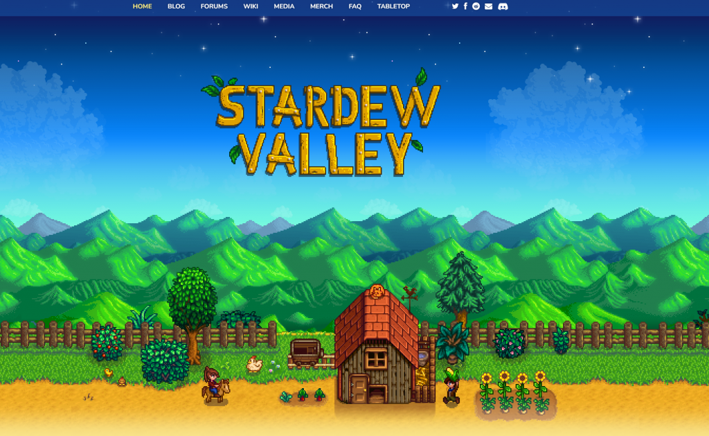
Players want to know what they’re getting into before they buy your game. Make sure to provide clear information about your game’s gameplay, features, and storylines.
Use keywords
When writing your descriptions, be sure to use keywords that players are likely to search for. This will help your game show up in search results.
Optimize for mobile
More and more people are using their mobile devices to play games. Make sure your descriptions and images are optimized for mobile so that players can easily view them on their phones and tablets.
Keep it updated
As your game evolves, be sure to update your descriptions and images to reflect the latest changes. This will help keep players informed about your game and make them more likely to buy it.
Selling Steam Keys

Steam keys are a great way to sell your game to a wider audience. They allow players to purchase your game on Steam, even if it’s not available in their region or if they don’t have a credit card.
There are a few different ways to sell Steam keys. You can sell them directly on your website or through a third-party marketplace. You can also sell them through a no-code storefront.
If you sell Steam keys directly on your website, you’ll need to set up a payment processor and integrate it with your website. This can be a bit technical, but it’s the most profitable way to sell Steam keys.
If you sell Steam keys through a third-party marketplace, you won’t need to worry about setting up a payment processor. However, you’ll have to pay a commission to the marketplace.
No-code storefronts are a good option if you don’t want to deal with the technical aspects of selling Steam keys. These platforms make it easy to set up a store and start selling keys without any coding knowledge.
No matter how you choose to sell Steam keys, make sure to price them competitively. You don’t want to price your keys too high, or players will simply buy them from Steam directly.
Summary
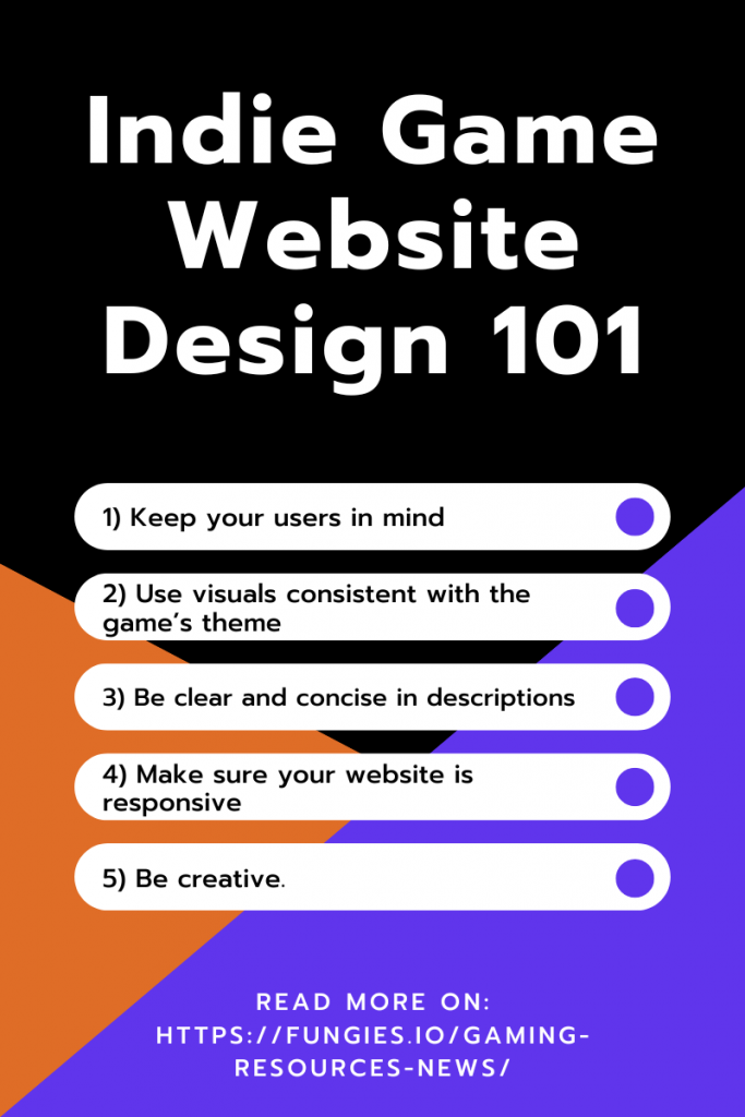
Creating an eye-catching and engaging indie game website can be a daunting task, but it’s essential if you want to attract players and build a community around your game. By following the tips in this blog post, you can create a website that is both visually appealing and user-friendly.
Here are the key takeaways:
Design your website with your users in mind
What do they need to know about your game? What kind of experience are you trying to create?
Use visuals that are consistent with the game’s theme and appeal to your target audience.
Create a cohesive brand identity that is reflected throughout your website and marketing materials.
Be clear and concise in your descriptions of the game’s details.
Use high-quality images and videos to showcase the game’s visuals and gameplay.
Make sure your website is responsive and easy to navigate on all devices.
By following these tips, you can create an indie game website that will help you promote your game and reach a wider audience.
