The indie gaming world is vibrant and diverse. This diversity spills over into the realm of digital presence, where every indie game developer dreams of crafting a game website design that mirrors the spirit of their game. The challenge? Ensuring your website’s visual charm doesn’t come at the expense of its utility.
The Power of First Impressions
Digital storefronts, particularly those of games, thrive on visual narratives. It’s a virtual representation of your game’s soul. However, a stunning façade with hidden navigation traps can push visitors away.
Real-World Scenario
Imagine a website with dazzling visuals from a fantasy game. Dragons, warriors, and vast landscapes. But if a visitor can’t find where to buy the game or read more about its lore within the first few minutes, they might leave, feeling both impressed and frustrated.
So, how to avoid such traps? That’s exactly what we are going to discuss here.
The Role of the Indie Game Website in Today’s Digital Ecosystem
Evolving Trends: From Static Pages to Mobile Game Web Shops
Once, static web pages were the norm. They were straightforward, often offering little more than game descriptions and a few screenshots. But the digital realm doesn’t stay still. Today, the trend leans heavily towards dynamic mobile game web shops. This progression allows developers to meet gamers where they are, offering them the convenience of purchasing and learning about games directly on their mobile devices.
The First Impression: Why Design Matters
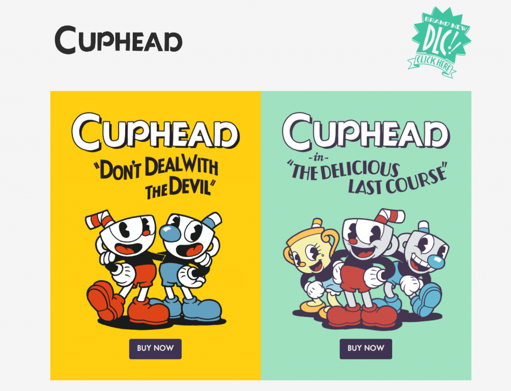
First impressions are everything. When a player lands on a game’s website, they immediately form opinions based on the design. It’s not just about pretty graphics; it’s about conveying the game’s spirit, its essence. A well-designed site can intrigue and invite players to explore more, while a cluttered or confusing one can deter potential players.
Significance of a User-Friendly Interface for Higher Game Sales
Beyond aesthetics, the usability of a website is crucial. A user-friendly interface can significantly boost game sales. Players want clarity. They want to know where to find game details, how to purchase, and what to expect from the game. If they can’t navigate easily or encounter obstacles, they’re less likely to make a purchase. Every element, from button placement to page transitions, should be geared towards a seamless user experience.
Starting with the Basics: Choosing the Right Platform
Why “One-Size-Fits-All” Website Builders May Not Be Ideal
Many website builders promote a “one-size-fits-all” approach. However, they might miss nuances specific to certain industries. For indie game developers, having tools tailored to their distinct needs is crucial. Generic website builders can lack the specialized features or flexibility vital to game developers, leading to potential compromises in design or functionality.
The Advantage of Website Builder for Games
Then there’s the website builder specifically designed for games. Created with the intricacies of the gaming world in mind, these platforms offer features like game showcases, integrations for selling game keys, and more. It’s not merely about crafting a website; it’s about building a comprehensive digital hub for everything related to the game.
Case in Point: No-Code Storefronts as Game-Changers
No-code storefronts offer a unique perspective. These platforms not only deliver game-specific tools but also remove the often steep learning curve associated with website development. By streamlining the process, developers can concentrate on their primary passion: creating unforgettable gaming experiences. The ease of setting up an attractive and functional game website with no-code solutions cannot be overstated.
Know Your Audience
Every game tells a unique story and appeals to a distinct group of players. This audience isn’t just a generic group; they have specific preferences, desires, and expectations. As a developer, understanding this audience is the first step in creating a web presence that resonates.
Demographics Deep Dive
Before you even choose a color scheme or decide on website features, it’s crucial to take a deep dive into your audience demographics. Who are they? What do they like?
For instance, if your strategy game is aimed at an older, more mature audience, they might appreciate a sleek, sophisticated website palette. This could be paired with detailed game lore sections that delve into intricate backstories, allowing them to immerse themselves more deeply in the world you’ve created. Conversely, a game targeting younger players could benefit from a lively, colorful interface. Bright visuals and interactive elements might engage this audience more effectively.
Player Preferences
But it goes deeper than age. Understanding player preferences in terms of game genre and mode can further tailor your website design.
For example, a multiplayer game, by its nature, revolves around community. A website for such a game should emphasize this, highlighting community features like forums, leaderboards, and player collaboration tools. This not only serves the game’s function but also fosters a spirit of camaraderie, making players feel part of a larger collective.
Actionable Strategy
In today’s digital age, data is a valuable asset. Tools like Google Analytics provide insights into user demographics and behaviors. By leveraging this data, you can refine your website design to cater more precisely to your audience’s preferences. Track user interactions, page visits, and bounce rates. Then, use this information to adjust your design and features for an optimized user experience. Remember, your website isn’t just a static entity; it’s a dynamic tool that, when used correctly, can significantly enhance your game’s appeal.
Visual Aesthetics: Crafting a Unique Digital Identity
The Role of Color, Typography, and Imagery
In the digital realm, first impressions often hinge on visual aesthetics. The right blend of color can evoke emotions and set the mood for your game’s story. Typography, more than just readable text, can reinforce your game’s character and tone. Meanwhile, imagery, be it in the form of background art or icons, can further solidify the thematic elements of your game. Each of these elements, when combined thoughtfully, crafts a distinctive identity for your game in the digital space.
Showcasing Game Graphics and Trailers
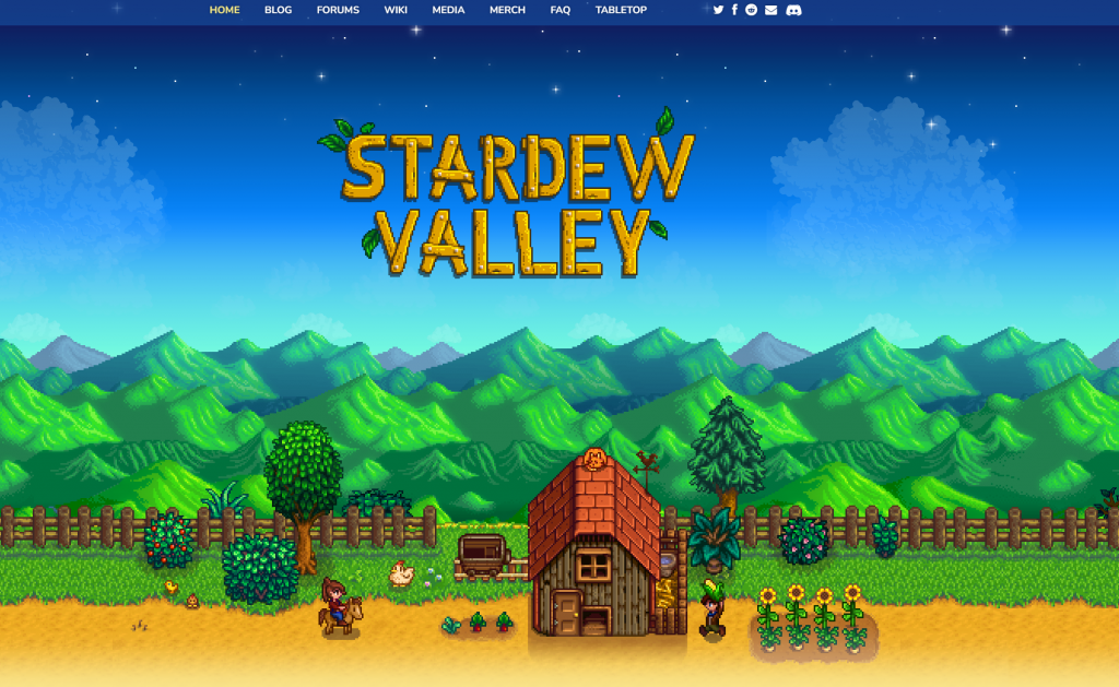
Your game’s graphics are its visual signature. When visitors land on your website, they’re eager to see a snapshot of the gameplay experience. Trailers, on the other hand, are dynamic windows into the game’s world. They provide a tantalizing preview, hooking potential players with snippets of gameplay, storylines, and in-game cinematics. By prominently displaying high-quality graphics and engaging trailers, you not only showcase your game’s visual prowess but also give users a taste of the adventure awaiting them.
Highlighting Key Game Features and Lore
While aesthetics draw players in, it’s the content that keeps them engaged. Diving deep into your game’s features and lore gives depth to your website. Outline gameplay mechanics, special features, and any unique selling points that set your game apart. Additionally, immerse visitors in the lore, sharing tales of the characters, worlds, and narratives that define your game. By spotlighting these elements, you turn a casual browser into an invested player, eager to dive into the world you’ve created.
Functionality: Ensuring a Smooth User Experience
Visual Hierarchy Essentials
This is your guiding tool. It ensures visitors see what you want them to see, in the order you desire.
Spotlight Features
For an RPG, the lore or story might be the selling point. Maybe it’s the gameplay mechanics for an action game. Highlight these features with visual cues.
Typography Tips
Using varied fonts and sizes can create a sense of hierarchy. But beware of overdoing it. Too many fonts can create visual chaos.
Actionable Strategy
Sketch wireframes. Start with rough paper sketches, move to digital mockups. This iterative process helps refine visual hierarchy.
Optimize for Speed
No one likes to wait, least of all gamers accustomed to instant respawns.
Load Time Tactics
Use asynchronous loading for scripts. Prioritize above-the-fold content. Lazy load images.
Server Significance
Ensure you’re on a reliable server. Consider dedicated hosting if traffic spikes are frequent.
Actionable Strategy
Regularly conduct speed tests. Tools like Pingdom or WebPageTest provide insights beyond just loading times, like bottlenecks or failed requests.
Navigational Clarity
A maze is fun in games, not on websites.
Menu Mastery
Multi-level dropdowns can house extensive links without cluttering the main navigation. But ensure they’re touch-friendly for mobile users.
Intuitive Interactions
Hover animations, clickable buttons, feedback on click—all these enhance user interactivity, making navigation intuitive.
Actionable Strategy
Conduct usability tests. Even informal ones, with friends or community members, can unearth navigational issues.
Responsive Design Rules
Diverse devices, one consistent experience.
Media Query Magic
Use media queries to adjust layouts based on device specifications. Ensure images and videos adapt too.
Touch and Click
Design keeping both in mind. What’s easily clickable might not always be touch-friendly.
Actionable Strategy
Regularly test your website on various devices. Use browser dev tools to simulate different devices or, better yet, real-world testing for authentic feedback.
Web3: The Digital Frontier
As we move towards a more decentralized web, game websites need to keep pace.
Blockchain Benefits
Incorporate features like crypto transactions. Offer special in-game assets for crypto purchases, enhancing value.
NFT Novelties
Limited edition NFTs can be both a revenue stream and a marketing tool. Ensure your website can showcase and sell them.
Actionable Strategy
Collaborate with blockchain experts. Their insights can guide Web3 integrations, ensuring you’re at the forefront of the digital revolution.
Gathering Feedback and Iterative Design

Community Feedback in Refining Design
In the realm of game development, the community plays an indispensable role. They’re not just players; they’re invaluable sources of insights, critiques, and recommendations. Engaging with and gathering feedback from the community can shed light on design elements that work and those that might need reconsideration. By placing value on their feedback, developers can refine and perfect their website’s design to best resonate with their target audience.
Tools and Techniques to Gather User Insights
Harnessing feedback requires more than just an open ear. Utilizing tools like surveys, feedback forms, and analytics platforms can provide quantifiable data on user behavior. Techniques such as A/B testing can help gauge the effectiveness of design changes. Online forums and community boards can also be instrumental, offering a platform for open discussions and more in-depth feedback. By leveraging these tools and techniques, developers can gain a comprehensive understanding of user preferences and pain points.
Adapting and Evolving: The Ongoing Journey of Website Refinement
A website isn’t a static entity; it’s an evolving digital space. The world of gaming is fast-paced, with shifting trends and evolving user expectations. Recognizing this fluidity, it’s essential for developers to approach website design as an ongoing journey. This means continuously adapting, iterating, and refining based on new insights and feedback. It’s a process of perpetual improvement, ensuring the website remains relevant, user-friendly, and aligned with the game’s evolving narrative.
Practical Tips and Tricks
Utilizing Game-Specific Website Templates
Jump-starting your website’s design process doesn’t mean compromising on quality. There are numerous game-specific website templates available that cater specifically to the needs of indie developers. These templates are tailor-made with built-in features optimal for showcasing games. By starting with such a template, developers can save time on initial design and focus on personalizing and refining to match their unique game’s identity.
Ensuring Scalability: From Indie Showcases to Full-Fledged Game Web Shops
The journey of an indie game developer can be dynamic, with projects evolving from small-scale showcases to comprehensive game shops. It’s vital to ensure your website can scale alongside this journey. Choosing a platform or website builder that offers scalability ensures you can seamlessly expand features, integrate e-commerce tools, or even sell steam keys as your game gains traction. Preparing for growth from the onset can save significant time and effort in the long run.
Making the Process of Buying a Steam Game Seamless for Users

One of the most crucial elements of a game website is the purchase process. If users face obstacles or complications when trying to buy a Steam game, it can deter potential sales. Focus on creating a clear, straightforward pathway for transactions. Integrate secure payment gateways, provide clear instructions, and ensure that obtaining game keys is a hassle-free process. A smooth buying experience enhances user trust and can significantly boost game sales.
Conclusion
Indie game developers wear many hats. From game design to marketing, it’s a challenging yet rewarding journey. Your game’s website is an extension of this journey—a digital realm where the virtual and real intertwine. Crafting it requires patience, insights, and a keen balance between the beautiful and the functional.
With a clear understanding of your audience, the right tools, and a commitment to continuous improvement, your website can become more than just a digital storefront—it can be a thriving community hub, an extension of your game’s universe.
Remember, every pixel counts, every second matters, and every feedback is a step towards perfection.
