Embracing the Single Page Website for Your Game
Why go single page? Let’s face it, the gaming world is fast-paced and highly visual. Players judge a game by its cover—or in this case, its website. A single page website offers a sleek, straightforward way to showcase your game, cutting through the noise and focusing on what’s important. It’s all about making a strong, immediate impact.
The Anatomy of a Single Page Website
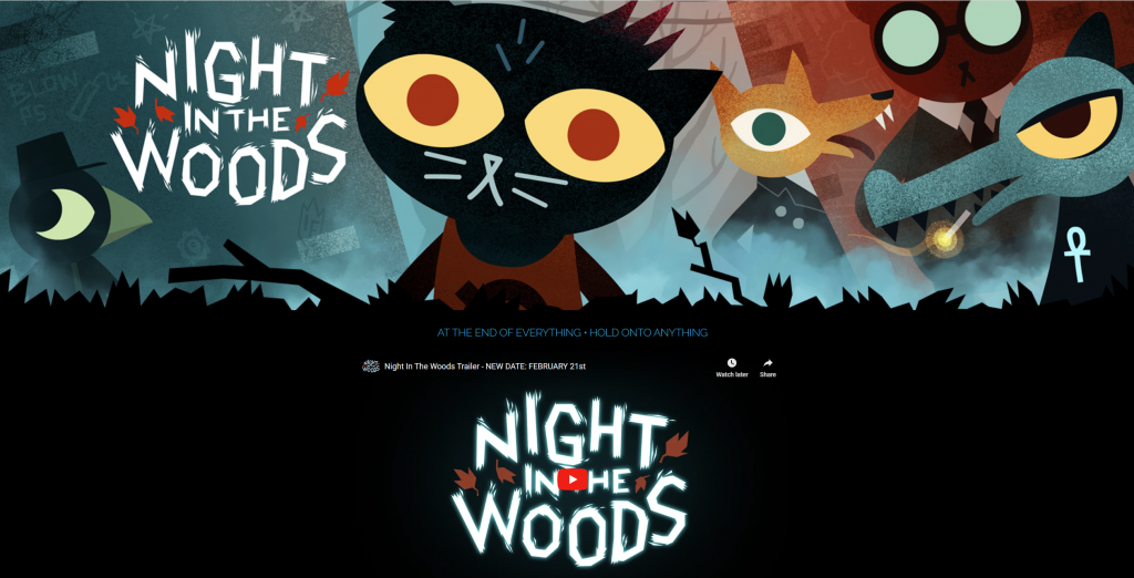
The Essentials of a Single Page Game Website
A single page website for your game isn’t just a trend; it’s a strategic choice. It centralizes all your content in one place, ensuring that visitors get the full picture without needing to click through multiple pages. It’s about giving everything at a glance.
Defining a One Page Website: Basics and Benefits
A single page website, also known as a one-page website, is a type of website that condenses all its content into one long scrollable page. For this kind of website, simplicity is key. A one page website distills the essence of your game into a single, scrollable page.
Unlike traditional websites with multiple pages for different sections like ‘Home’, ‘About’, and ‘Contact’, a single page website combines all these elements into one seamless flow. This approach prioritizes simplicity and ease of navigation, allowing visitors to scroll through everything from the game’s overview, features, trailers, to contact information without clicking through various pages
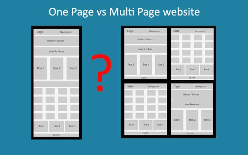
This structure not only streamlines the user experience but also offers faster loading times and a concentrated focus on your game’s most compelling aspects, which is crucial for capturing and retaining user interest in the competitive gaming market.
Key benefits of a one page website:
simplicity
fast loading time
easy navigation
focused user experience
Why Single Page Websites are Ideal for Games
Games thrive on immersion and storytelling. Single page websites mirror this by providing a seamless narrative about your game. As users scroll, they journey through the story of your game, from introduction to call-to-action, without interruption or distraction. You can make a use of this by weaving a narrative into this user journey giving them a taste of your game from the first click.
And this naturally leads us to the next chapter. Which is:
Planning Your Single Page Website
By carefully planning your website’s goals and content strategy, you create a solid foundation for a single page website that effectively communicates your game’s value and encourages user interaction.
Setting Goals – What Your One Page Website Should Achieve
When planning your single page website, the first step is setting clear, achievable goals. These goals will be the driving force behind every design decision and content piece on your website.
Here are some common objectives:
Increase Game Downloads
If your primary goal is to boost game downloads, your website should focus on persuasive call-to-action (CTA) buttons, enticing game previews, and easy access to download links.
Community Building
To grow a community around your game, integrate social media links, forums, or sign-up forms for newsletters to keep your audience engaged and connected.
Portfolio Showcase
For showcasing a portfolio, especially relevant for indie developers or studios, highlight your game’s unique features, development journey, and other projects to attract potential collaborators or investors.
Naturally, each goal demands a specific approach in terms of design and content. Understanding these nuances will help create a website that looks great and performs effectively in achieving your objectives.
Content Strategy – Organizing Information on a Single Page
Keeping your goal in mind, the next step is crafting a content strategy that keeps your audience engaged while scrolling through your website. Here’s how to do it:
Balancing Text and Visuals
A good mix of engaging visuals and informative text is vital. High-quality images, GIFs, and videos of your game can capture attention, while well-written text provides depth and context.
Clear Messaging
Ensure that your messaging is straightforward and to the point. Each section of your website should communicate a clear message about your game and what you want your audience to do next.
Purposeful Elements
Every element on your page should serve a purpose. Whether it’s a gameplay video, a list of features, or a review section, it should contribute to your overall goal and enhance the user experience.
Logical Flow
Organize your content in a logical sequence. Start with an engaging introduction, followed by in-depth details about your game, and end with a strong CTA. This flow should guide the visitor naturally through your game’s story and features.
Design Principles for Single Page Game Websites

Visual Hierarchy: Guiding Players with Design
In design, hierarchy is everything. It guides the player’s eye through your content in a logical, pleasing manner. Use size, color, and layout to emphasize key sections like game trailers, features, and download links.
Balancing Graphics and Information on One Page
Your game is visually stunning—your website should be too. But balance is important. Too much text can be overwhelming, while too many graphics can slow down your site. Striking the right balance will keep your audience engaged and informed.
User Experience on Single Page Websites
Simplifying Navigation – The One Page Approach
When it comes to user experience on single page websites, simplicity in navigation is just there in the design. This approach involves having all the content on one long, scrollable page, eliminating the need for complex menus or multiple page links. It’s intuitive – users simply scroll down to discover more about your game. This simplicity is particularly effective for game websites, as it mirrors the straightforward, engaging experience users expect from gaming. However, why not improve it even more by implementing some simple hacks?
Highlighting Key Sections
Utilize clear headings and visually distinct sections to make it easy for users to find what they’re interested in.
Scroll Indicators and Navigation Bars
Implement subtle navigation aids like a sticky menu or progress indicators that help users understand where they are on the page.
Speed and Performance – Keeping Your Site Agile
For gamers, website performance is non-negotiable. A slow-loading site can be a major turn-off, so optimizing for speed is crucial.
Optimize Images and Videos
Large files can drastically slow down your website. Use optimized, web-friendly formats and consider lazy loading for heavy media elements.
Streamline Your Code
Clean, efficient code helps improve website loading times. Minimize the use of heavy frameworks and plugins that can bog down your site’s performance.
Choose a Reliable Host
Your hosting service plays a significant role in your website’s performance. Opt for a host known for its speed and uptime to ensure your site is always running smoothly.
Regular Performance Checks
Regularly test your website’s speed using tools like Google PageSpeed Insights. This will help you identify and fix any issues that may arise over time.
Crafting Your Game’s Story on a Single Page

Storytelling in Design – Creating a Narrative Journey
Your website should tell the story of your game. Use imagery, text, and interactive elements to take visitors on a journey, just like your game does. Think of your website as the opening level of your game—it sets the stage for what’s to come.
Showcasing Your Game: Videos and Images in a Compact Space
A picture is worth a thousand words, and a video even more. Showcase your game with high-quality screenshots, trailers, and gameplay videos. These visuals are powerful tools for conveying the essence of your game and enticing players to dive in.
Technical Aspects of Building a Single Page Website
Choosing the Best Single Page Website Builder
There are plenty of website builders out there, but which is right for you? Look for ones that offer templates specifically designed for gaming, along with customization options to make your website as unique as your game.
Domain and Hosting
Your website’s domain is like your game’s title—it should be memorable and relevant. Choose a domain name that reflects your game and find a hosting service that offers the performance and support you need to keep your site running smoothly.
Optimizing for Mobile – A Must for Single Page Sites
Responsive Design – Adapting to Various Screen Sizes
With more people browsing on mobile than ever, your website must look great on any device. Responsive design ensures your site adjusts to any screen size, providing an optimal viewing experience for all visitors.
Mobile-First Design – Prioritizing Smartphone Users
Think mobile-first. This means designing for smaller screens initially and scaling up for larger ones. It ensures that your website is accessible and appealing to the vast majority of users who will visit your site on their phones.
Engaging Features Specific to Game Websites
Integrating Interactive Elements: Demos, Trailers, and More
Interactive elements are the heart of an engaging game website. They offer visitors a dynamic and immersive glimpse into your game.
Playable Demos
Including a playable demo directly on your site allows visitors to experience a slice of the game, boosting their interest and engagement. Ensure the demo is easily accessible and offers a meaningful insight into the game.
Engaging Trailers
Trailers can be powerful storytelling tools. Use them to introduce the game’s story, characters, and world. Ensure they are high quality and captivate the viewer’s interest within the first few seconds.
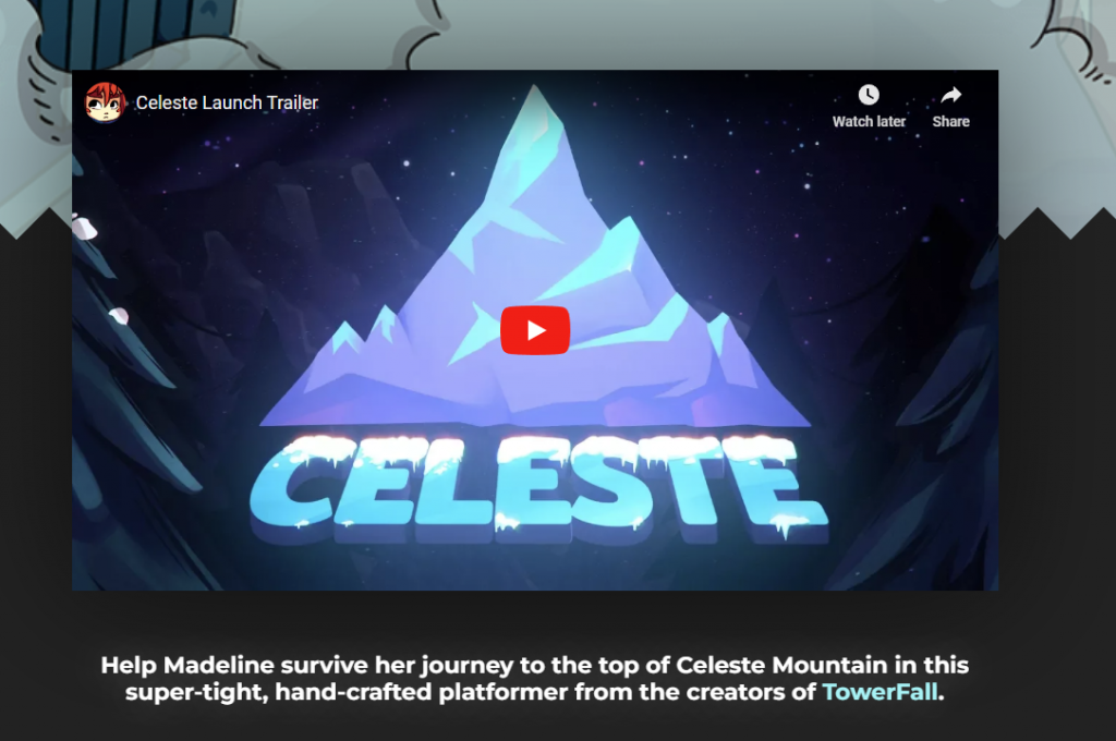
Image Galleries
Galleries showcasing concept art, in-game screenshots, and character designs provide visual insights into the game’s development process and artistry. Implement sliders or lightboxes for a sleek viewing experience.
Call-to-Action – Turning Visitors into Gamers
The call-to-action (CTA) is a critical component of your game’s website. It’s the moment where you convert visitors into players, followers, or community members. Here’s how to make your CTA stand out:
Visibility
Place your CTA in a prominent position on your site. It should be immediately noticeable as users scroll through.
Clarity and Conciseness
Use clear, concise language that tells visitors exactly what to do, like “Download Now,” “Join the Community,” or “Watch the Trailer.”
Urgency and Value
Create a sense of urgency or value. Phrases like “Play the Demo Today” or “Join Now for Exclusive Updates” can motivate users to take action.
Design
Design your CTA to stand out. Use colors, fonts, and shapes that draw attention without clashing with the overall design of the site.
Testing and Optimization
Test different versions of your CTA to see which performs better. Use A/B testing to refine its wording, placement, and design for the best results.
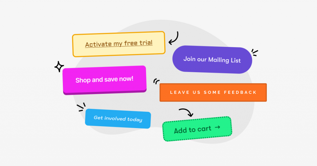
A well-crafted CTA is more than just a button or a line of text; it’s an invitation to the visitor to take the next step in experiencing your game. It’s about creating a connection and prompting an action that benefits both the visitor and your game. Make it count!
SEO for Single Page Game Websites
Keywords and SEO Strategies for One Page Sites
SEO might seem daunting, but it’s crucial for your site’s visibility. Use relevant keywords throughout your content, optimize your images, and ensure your site’s loading speed is up to par. These steps will help your site rank better in search results.
Tracking and Improving Your Site’s Visibility
Once your site is live, track its performance. Use tools like Google Analytics to understand your traffic and make data-driven decisions. Regularly updating your SEO strategies based on these insights will keep your site visible and relevant.
Maintaining and Updating Your Single Page Website
Keeping Content Fresh – A Guide for Busy Developers
Your game evolves, and so should your website. Regular updates, whether they’re news, patches, or new content, keep your site fresh and give visitors a reason to return. Set a schedule for updates and stick to it.
Routine Check-ups – Ensuring Site Health and Performance
Regular maintenance is key to a healthy website. Check for broken links, outdated content, and performance issues. Keeping your site in top shape ensures a great experience for every visitor.
Analyzing User Interaction and Feedback
Tools for Understanding Visitor Behavior

Understanding how visitors interact with your site can give you valuable insights. Tools like heat maps and behavior analytics can show you what’s working and what’s not, allowing you to optimize your site for better engagement.
Learning from User Engagement – What Works and What Doesn’t
Take note of how users interact with your site. Which sections do they spend the most time on? What do they click on? Use this feedback to refine your site’s content and design, making it even more engaging and effective.
Making a Lasting Impression with a Single Page Site
Creating a memorable online presence for your game is more than just about having a website; it’s about crafting an experience that resonates with your audience. A single page website offers just that—an opportunity to make a lasting impression with a format that’s as engaging and dynamic as the games themselves.
Simplicity Meets Sophistication
The beauty of a single page site lies in its simplicity. It strips away the clutter, focusing the visitor’s attention on what truly matters – your game. This simplicity, however, doesn’t compromise sophistication. With the right design, your single page site can showcase your game with elegance and flair.
Storytelling at its Best
Your game has a story to tell, and so should your website. A single page site allows you to weave this narrative in a cohesive, uninterrupted flow. From the opening hook to the closing CTA, your website can take visitors on a journey that mirrors the experience of playing the game itself.
Engagement and Interaction
The interactive elements of a single page website – like demos, trailers, and galleries – are not just features; they are invitations for engagement. They encourage visitors to interact, explore, and connect with your game on a deeper level.
Efficiency and Effectiveness
In a world where attention spans are short, efficiency is key. A single page website gets your message across quickly and effectively. It loads faster, is easier to navigate, and translates well across different devices, ensuring that your audience enjoys a seamless experience.
As you embark on creating your single page website, remember it’s more than just a digital brochure for your game; it’s a platform for storytelling, engagement, and connection. With thoughtful planning, intuitive design, and compelling content, your website can become a central tool in your game’s success. So, take the leap, start building your single page site, and prepare to make a striking first impression that lasts.
