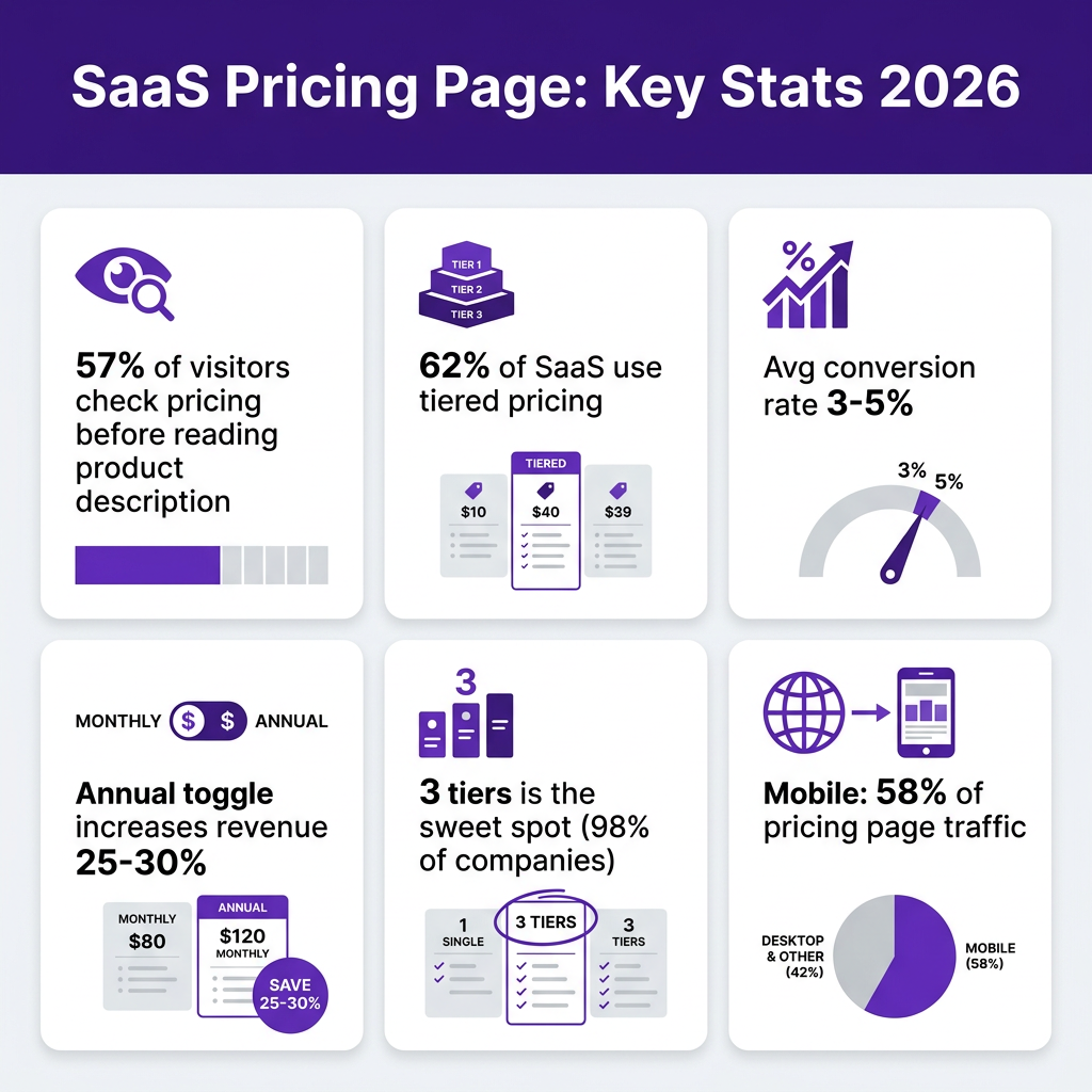
57% of SaaS visitors check the pricing page before they’ve even read your product description. That’s not a typo — more than half your prospects are making up their minds based on that one page before they understand what you actually built. And most pricing pages are actively losing those people.
The problem isn’t pricing. It’s the page. Cluttered tiers, vague CTAs, no clear recommendation, hidden fees buried in footnotes — these are conversion killers that compound quietly in the background while you’re focused on acquisition. A well-designed pricing page can boost conversion rates by 25–30% without touching your ads or your product.
This guide breaks down exactly what works in 2026: which elements convert, which patterns kill trust, and how to apply pricing psychology without being manipulative. We’ve pulled real data from ProfitWell, ChartMogul, and InfluenceFlow’s 2025–2026 pricing reports so you’re not guessing.
Why Your Pricing Page Is the Highest-Leverage Page You Have
Your homepage attracts curious visitors. Your blog builds trust over time. Your pricing page is where decisions get made — fast.
People landing on your pricing page already know what you do. They’re evaluating whether it’s worth their money. That’s a completely different mental state from someone who just discovered you. And most SaaS founders treat this page like an afterthought, updating it once a quarter with minor copy tweaks and calling it optimization.
The numbers make the case clearly:
- 57% of SaaS visitors check pricing before reading the product description (2024 Pricing Strategy Report)
- 62% of SaaS companies use tiered pricing in 2026 — and it’s the top-converting model (Pricing Platform, 2025)
- Average SaaS lead-to-paid conversion rate: 3–5% for most companies, but top performers hit 10–15%
- Annual billing toggle alone can increase revenue per customer by 25–30% when surfaced correctly
- 58% of pricing page traffic now comes from mobile (InfluenceFlow, 2026)
The gap between a 3% and a 10% conversion rate isn’t usually product quality. It’s page quality. Let’s fix that.
SaaS Pricing Page Best Practice #1: Three Tiers, Not Five
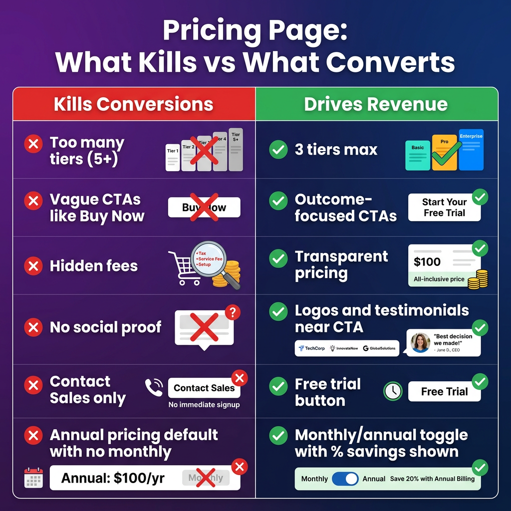
The most common mistake SaaS founders make is adding pricing tiers as their product grows. Start with 3, ship a couple of features, add an “Advanced” tier, then a “Starter” below that, then an “Enterprise” above everything. Suddenly you’ve got 5–6 tiers and visitors are paralyzed.
According to Price Intelligently, 98% of SaaS companies offer multiple pricing tiers — with three being the highest-converting configuration. The psychology here is simple: three options create a natural comparison framework (low/mid/high), while five or more create decision fatigue.
The sweet spot for 2026:
- Starter/Free — Low friction entry point. Captures leads you’d otherwise lose.
- Pro/Growth — Your recommended tier. This is where most of your revenue should come from.
- Business/Scale — Higher price anchor that makes Pro feel reasonable by comparison.
If you need enterprise pricing, pull it out of the tier grid entirely. Put “Enterprise — Contact us” as a fourth option styled differently so it doesn’t compete visually with the main tiers.
What to put in each tier: focus on outcomes, not feature lists. “Run unlimited A/B tests” converts better than “A/B testing module.” “Tax handled automatically in 100+ countries” converts better than “Global tax compliance.” Tell people what they can do, not what’s included.
SaaS Pricing Page Best Practice #2: Highlight One Plan Visually
If your pricing page treats all three tiers equally, you’re leaving money on the table. The middle plan needs to win — it’s your best margin-per-customer ratio and the one most visitors can justify to themselves or their manager.
Make the recommended tier visually distinct:
- Give it a colored background (your brand color works best)
- Add a “Most Popular” or “Best Value” badge — avoid “Recommended” since it feels generic
- Make the CTA button more prominent (size, contrast, or both)
- Consider scaling it slightly larger than the other cards
This isn’t manipulation — it’s decision guidance. Visitors arrive with a real problem to solve. Showing them where most people like them end up reduces cognitive load and increases confidence. It also creates a pricing anchor: when people see the Enterprise tier first (or your most expensive plan on the left), the middle plan looks reasonable by comparison.
Left vs. right positioning: Most SaaS companies list tiers from low to high (left to right). That’s fine for transparency, but some high-ACV products reverse this to lead with the premium anchor. Test it — results vary by audience.
SaaS Pricing Page Best Practice #3: Annual/Monthly Toggle Done Right
The annual vs. monthly toggle is the single highest-ROI element on most SaaS pricing pages. Done right, it increases revenue per customer by 25–30% (ProfitWell) and improves retention because annual customers churn less.
But most implementations fumble the execution. Here’s what actually works:
Default to annual. When you show monthly pricing first, visitors anchor to that number. When they switch to annual, the yearly total can feel like sticker shock. Show annual upfront — it often means a lower monthly equivalent — and let users switch to monthly if they need to.
Show the savings explicitly. Not just “Save 20%” — show the dollar amount. “Save $240/year” is more concrete than a percentage. Put the savings in the toggle itself, not buried below the price.
Don’t make annual feel forced. If users want monthly, let them have it. The goal is incentive, not coercion. Locking out monthly or hiding it erodes trust more than the extra revenue is worth.
Show the per-month equivalent for annual plans. “$99/month, billed annually” is cleaner than “$1,188/year” even if it’s the same number. Monthly comparisons feel smaller and more manageable.
SaaS Pricing Page Best Practice #4: CTAs That Convert vs. CTAs That Confuse
The CTA is the last thing standing between your pricing page and a conversion. Most SaaS companies waste it.
What kills CTA performance:
- “Buy Now” — people aren’t buying software like Amazon products. They’re starting a relationship.
- “Get Started” — so generic it says nothing
- “Contact Sales” as the primary CTA for products under $200/month — adds friction to a decision that could be self-serve
- Multiple competing CTAs with equal visual weight
What actually converts:
- “Start free trial” — removes risk, creates urgency
- “Try [Product] free for 14 days” — specific, action-oriented
- “Get [Starter/Pro] — start free” — tier-specific reduces abandonment
- Secondary CTA: “See how it works” (links to demo video) — for visitors not ready to commit
ChartMogul’s conversion data shows that free trial landing points have median 8% conversion to paid across all SaaS products. Products requiring credit card on trial entry see substantially higher conversion — but also substantially lower trial starts. For most products under $50/month, no-credit-card trial wins on total revenue. For higher ACV, card-required filters out tire-kickers and increases conversion-to-paid among starters.
| CTA Type | Best For | Avg Free-to-Paid Conversion | Trial Start Volume |
|---|---|---|---|
| Free trial, no card | <$50/month products | 4–8% | High |
| Free trial, card required | $50–200/month products | 10–15% | Medium |
| Freemium entry | Viral/PLG products | 5–6% (long tail) | Very high |
| Contact Sales only | Enterprise $500+/month | Varies (high ACV) | Low |
| One-time purchase | Lifetime deals, tools | 2–5% of visitors | Medium |
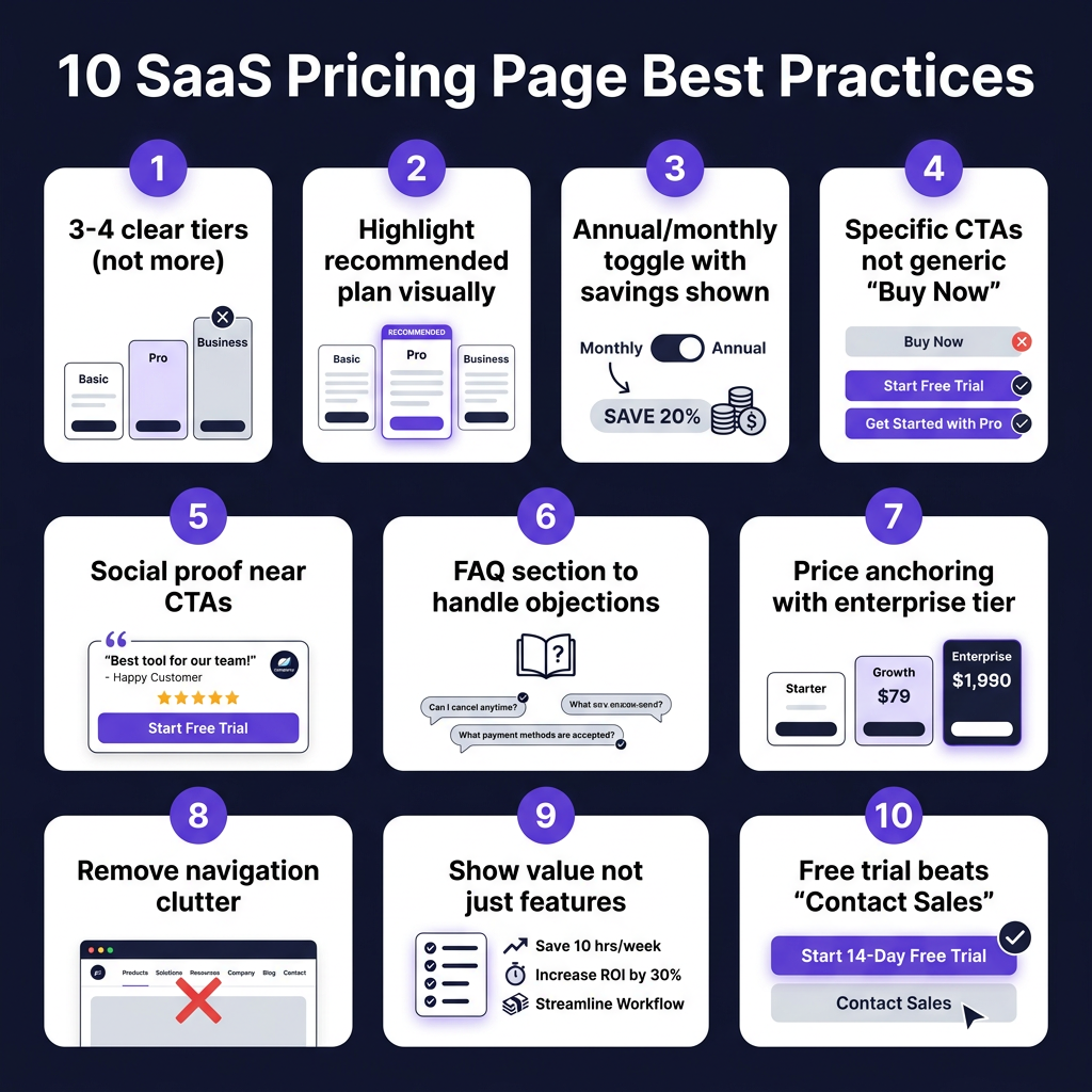
SaaS Pricing Page Best Practice #5: Social Proof Placed Where It Actually Works
Adding testimonials to your pricing page is table stakes. Where you put them is what separates good from great.
The mistake: a testimonials section at the bottom of the page, after the pricing table, where skeptical visitors have already decided to leave. They’ve scrolled past the tiers, hit friction at the CTA, and are now in “exit mode” — a generic quote from a VP at a company they’ve never heard of won’t stop them.
The fix: place social proof directly next to — or beneath — each CTA. When a visitor is hovering between clicking and not clicking, a specific quote from someone like them is the exact nudge they need.
What works in 2026:
- Customer logos near the CTA — Recognizable company names build trust without requiring anyone to read
- Star ratings + review counts — “4.8/5 on G2 (230 reviews)” near the CTA is high-signal social proof
- Outcome-specific quotes — “We went from $0 to $15K MRR in 6 months using Fungies as our payments layer” > “Great product, highly recommend”
- Tier-specific testimonials — A startup quote under the Starter plan. A growing team quote under Pro. Enterprise logos under the top tier.
Trust signals that seem minor but matter: “No credit card required,” “Cancel anytime,” “Setup in 5 minutes,” “SOC 2 compliant” — these remove specific purchase objections. Put them directly under the CTA buttons.
SaaS Pricing Page Best Practice #6: The FAQ Section Is a Conversion Tool
Most SaaS companies treat the pricing page FAQ as a support section — questions about refunds, technical limits, seat definitions. That’s fine, but you’re missing the real use case.
Your FAQ section exists to handle the three to five objections that are preventing your best prospects from clicking “start trial” right now. You know what those objections are: you get them on sales calls, in support tickets, in churned customer surveys. Put those questions — and honest answers — directly on the pricing page.
Examples of high-conversion FAQ questions for SaaS:
- “Do I need a credit card to start?” — Reduces signup friction for free trials
- “Can I change plans later?” — Addresses commitment anxiety
- “What happens to my data if I cancel?” — For data-sensitive industries
- “Is this right for a team of one?” — Validates solo founders / small businesses
- “How does billing work for annual plans?” — Removes confusion about payment timing
- “Do you handle VAT and sales tax?” — Critical for international buyers
On that last point: if you’re using Fungies.io as your checkout (or another Merchant of Record), you can answer “yes, tax is handled automatically” — which removes a significant purchase blocker for European and international customers who worry about VAT compliance.
SaaS Pricing Page Best Practice #7: Remove Navigation and Exit Paths
This one feels counterintuitive but has clear data behind it: removing your main navigation from the pricing page increases conversion. Swipepages reports that landing pages with no navigation convert at higher rates than those with full headers.
The reason is focus. Your navigation is designed to help people explore your product — but someone who’s already on your pricing page doesn’t need to explore more. They need to decide. Every link that takes them back to features, the blog, or the about page is an exit path you’ve voluntarily opened.
Options for 2026:
- Remove navigation entirely — Works best for paid ad landing pages pointing to pricing
- Minimal nav — Logo (links to homepage) + CTA button only. No full menu.
- Sticky nav — Keep it there but make it thin and unobtrusive; include only the primary CTA button
If your pricing page is a core part of organic SEO (it should be), keep enough structure to support on-page navigation for long pages. An anchor-linked table of contents (Starter | Pro | Business | FAQ) helps users jump to what they need without leaving.
SaaS Pricing Page Best Practice #8: Price Anchoring and Decoy Pricing
Anchoring is the psychological principle where the first number you see shapes how you evaluate everything after it. In SaaS pricing, this is one of the most reliable levers you have.
The three-tier model naturally creates anchoring: your most expensive tier makes your middle tier look reasonable. If your Enterprise plan costs $299/month and your Pro plan costs $99/month, Pro feels affordable. If there was no Enterprise tier, $99 would feel expensive.
ProfitWell data shows that companies implementing effective three-tier pricing with proper anchoring see an average 30% increase in revenue per customer compared to single-tier pricing.
Decoy pricing takes this further: you create a middle tier that’s priced to make one specific tier look like the obvious choice. Classic setup:
- Starter: $29/month (limited features)
- Pro: $79/month (everything in Starter + key features) ← the one you want to sell
- Business: $199/month (everything in Pro + team features)
The gap between Starter and Pro ($50) feels small when Business is $199. So Pro becomes the easy choice. This isn’t manipulation — it’s the architecture of clear value communication.
| Pricing Element | Impact on Revenue | Implementation Difficulty | Priority |
|---|---|---|---|
| 3-tier structure with highlighted middle | +25–35% vs. flat pricing | Low | High |
| Annual toggle (default annual) | +25–30% revenue per customer | Low | High |
| Specific outcome-based CTAs | +15–20% click-through | Very Low | High |
| Social proof near CTAs | +10–15% conversion | Low | Medium |
| Remove navigation | +5–10% on paid traffic | Very Low | Medium |
| FAQ objection handling | +8–12% on organic | Very Low | Medium |
| Mobile-optimized layout | Required for 58% of traffic | Medium | High |
SaaS Pricing Page Best Practice #9: Mobile-First Layout in 2026
58% of SaaS pricing page traffic is now on mobile (InfluenceFlow, 2026). Yet most pricing pages are still designed for desktop first, with horizontal comparison tables that collapse badly on small screens.
The horizontal three-column layout that looks great on a 1440px monitor becomes a mess at 375px. Columns stack awkwardly, feature comparisons lose their visual alignment, and the CTA buttons end up below the fold.
Mobile-optimized pricing page layout:
- Vertical card stack — Each plan as a full-width card, scrolled vertically. Your recommended plan first.
- Collapsible feature comparison — Show the top 5 differences expanded. Let users expand “See all 30 features” if they want.
- Sticky CTA — A fixed “Start trial” button at the bottom of the viewport as users scroll through plan details
- Tab navigation for plans — “Starter | Pro | Business” as tabs at the top, switching the content below without scrolling
If you’re running a Merchant of Record checkout (via Fungies.io, Paddle, or similar), make sure your checkout widget is also mobile-optimized. A great pricing page that drops into a clunky fullscreen redirect checkout will tank the conversions you just earned. Embedded checkout — no redirect — solves this for mobile users.
SaaS Pricing Page Best Practice #10: Real Examples That Actually Convert
Let’s look at what high-converting pricing pages actually do well:
Notion: Clean three-tier layout. Free plan prominent (drives PLG). Clear feature differentiation between Personal and Team. Annual pricing default. Transparent limits. No nav clutter.
Linear: Dark mode that signals developer audience immediately. Three tiers. Pricing is dead simple — single number per tier. Feature comparison table below the fold for the detail-oriented. No “Contact Sales” blocking the self-serve flow.
Slack: Uses a four-tier grid but makes it work by making Enterprise visually distinct (not part of the main comparison table). Monthly/annual toggle. “Most Popular” badge on Pro. Logos of recognizable customers embedded in the page.
Figma: Leads with outcomes in each tier header (“For individuals,” “For growing teams”). Price anchored top-right. Feature list uses checkmarks for included, dashes for excluded — clear visual scanning. FAQ immediately below pricing.
Common thread: all of these are clean, specific, and guide you toward a decision. None of them try to show you everything at once.
Key Takeaways
- Three tiers wins. 98% of SaaS companies use multiple tiers; three is the sweet spot for conversion. Five or more creates paralysis. Highlight the middle tier visually.
- Default to annual pricing. Show monthly equivalent, show dollar savings. Annual customers churn less and are worth 25–30% more in revenue per customer.
- Replace generic CTAs immediately. “Start free trial” or “Try [Product] free for 14 days” outperforms “Get Started” or “Buy Now” every time. Make CTAs tier-specific.
- Put social proof next to the CTA, not at the bottom. A specific outcome quote from a customer like your prospect, placed right next to the signup button, removes last-second hesitation.
- Handle objections in the FAQ. The 3–5 reasons people don’t click your CTA are predictable. Answer them directly on the page: credit card required? data security? billing changes? Make it feel safe to start.
Frequently Asked Questions
How many pricing tiers should a SaaS product have?
Three is the optimal number for most SaaS products. Research from Price Intelligently shows that 98% of SaaS companies offer tiered pricing, and three tiers hit the sweet spot of customer segmentation vs. decision clarity. A fourth “Enterprise/Contact us” option can work if styled separately from the main grid.
Should my pricing page default to annual or monthly pricing?
Default to annual with the monthly equivalent shown. ProfitWell data shows that customers on annual plans generate 25–30% more revenue and churn at significantly lower rates. Showing “billed annually” with a clear per-month equivalent reduces sticker shock from the annual lump sum. Always give users the option to switch to monthly — locking them out of monthly erodes trust.
Does removing navigation from a pricing page actually improve conversion?
Yes, particularly for paid ad traffic. Navigation links are exit paths for high-intent visitors who are already on your pricing page. For organic landing pages, a minimal navigation (logo + one CTA) is a good compromise. If your pricing page is embedded in your main site and ranking for SEO keywords, keep enough structure to support crawling and user context.
What’s the best way to handle VAT and tax on a SaaS pricing page?
Show prices excluding tax and add a single line: “Prices shown exclude applicable VAT/sales tax, calculated at checkout.” If you’re using a Merchant of Record like Fungies.io, you can confidently say “All taxes calculated and remitted automatically” — this is a real conversion boost for European customers who worry about VAT compliance. For US-only products, you can show prices inclusive of estimated tax ranges or simply note “tax calculated at checkout.”
Conclusion
Your pricing page isn’t a static list of features and prices. It’s the highest-intent page on your entire site — the moment someone decides whether your product is worth their money. Treating it like a spreadsheet is leaving serious revenue on the table.
The fundamentals haven’t changed: be clear, be specific, remove friction, build confidence. What’s changed in 2026 is the bar. Visitors compare you to the best pricing pages they’ve seen on other products. If yours looks outdated, cluttered, or confusing next to your competitors’, you lose.
Start with the highest-leverage changes: three tiers, highlight your middle plan, add the annual toggle, replace your generic CTAs with outcome-specific copy, put a quote next to your CTA. These take hours to implement and can move your conversion rate significantly.
Once you’ve sorted your pricing page, the next piece is making sure the checkout experience that follows it is just as frictionless. A seamless, embedded checkout with global tax handling is what turns a pricing page conversion into a paying customer. That’s exactly what Fungies.io is built for — no redirects, global MoR coverage, tax handled automatically, so the payment experience matches the pricing page you just optimized.
References
- InfluenceFlow: SaaS Pricing Page Best Practices: Complete Guide for 2026
- ChartMogul: The SaaS Conversion Report: Free-to-Paid Conversion
- Grafit Agency: Conversion Rate Optimization Best Practices for SaaS in 2026
- Dodo Payments: SaaS Pricing Strategy: A Data-Driven Guide for 2026
- Price Intelligently/ProfitWell: Pricing Strategy Research (20,000+ SaaS companies)
- Vemetric: Pricing Page Analytics for More Signups in 2026
- Vezadigital: Best SaaS Pricing Page Examples: Design That Converts (2026)